Friday 22 March 2013
Thursday 21 March 2013
Photos taken during Filming


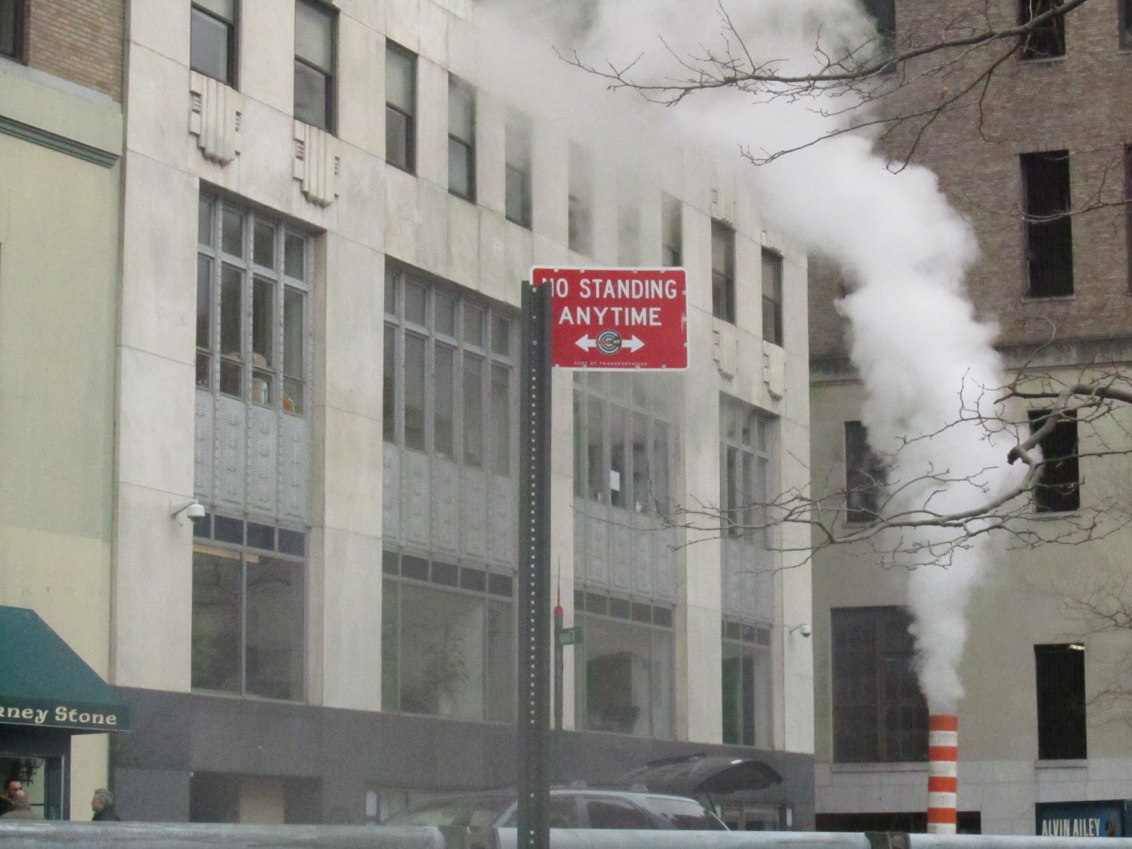
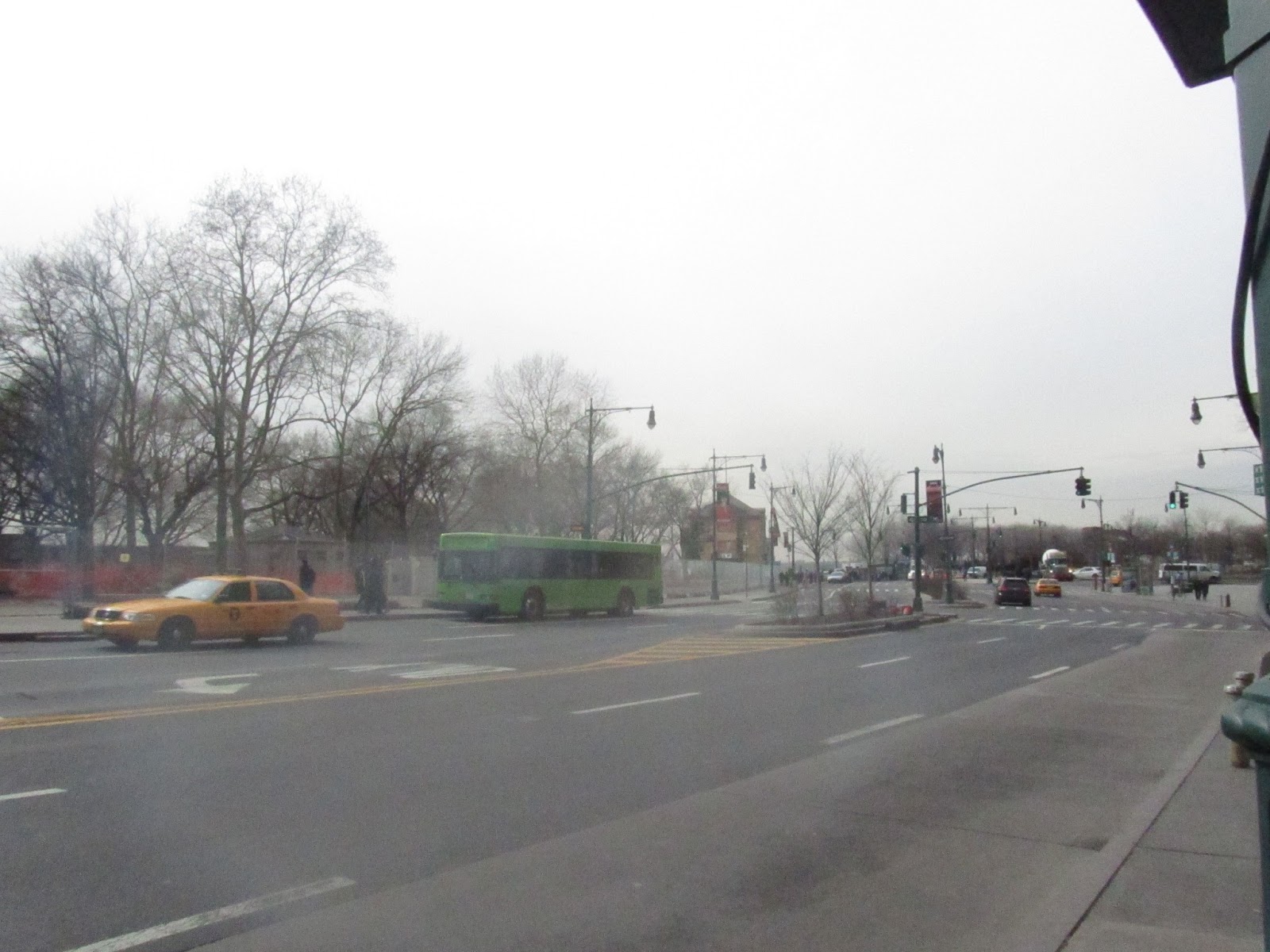
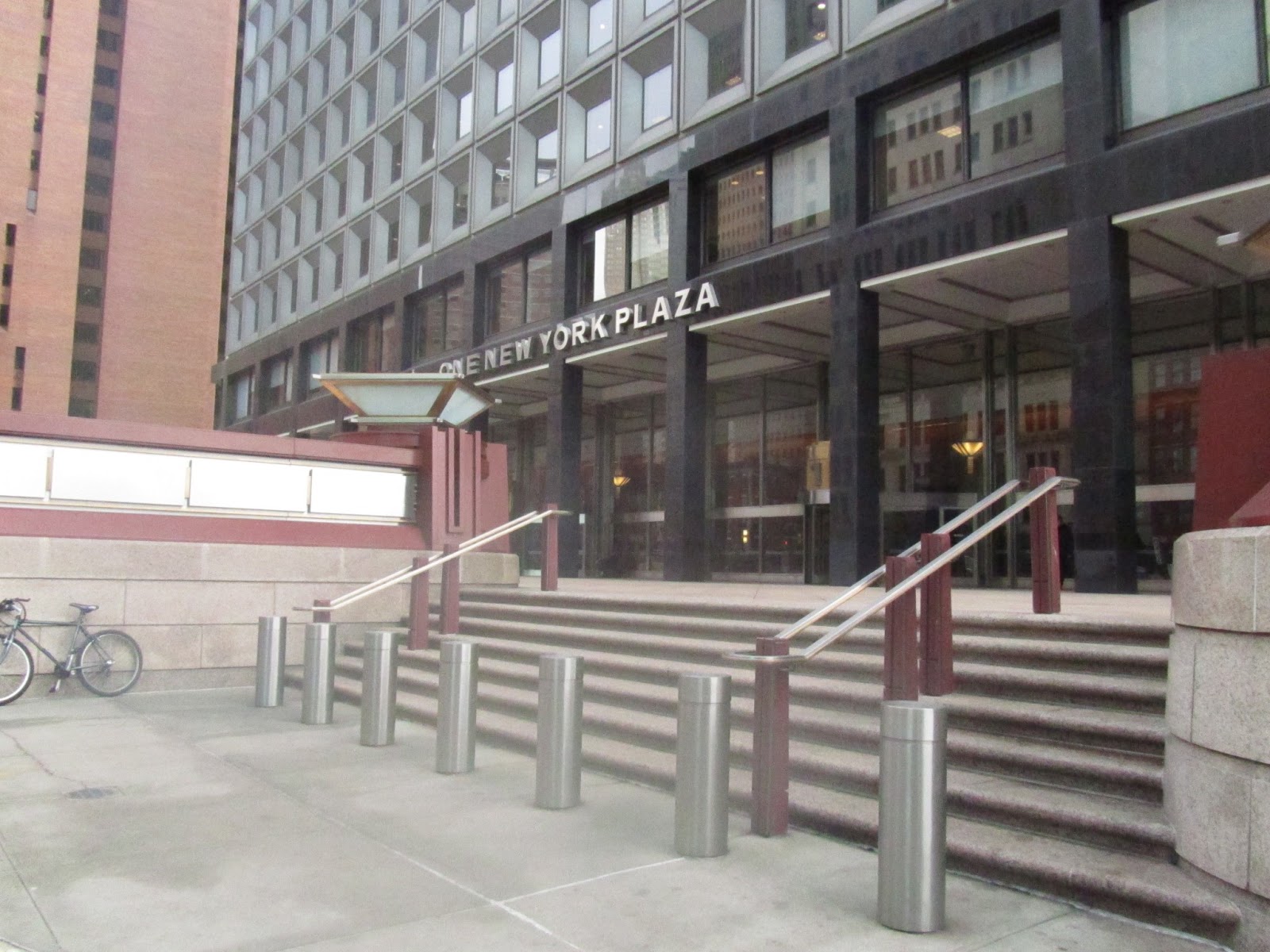
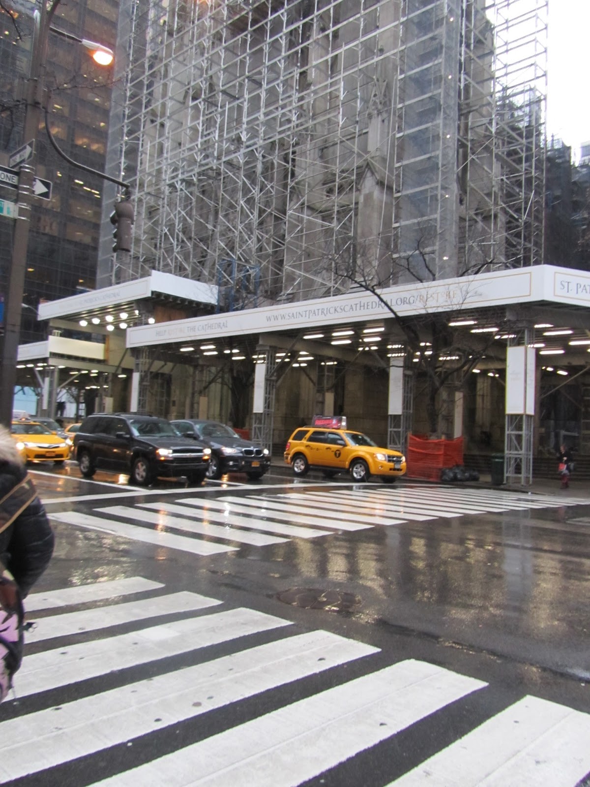
The above photos show me filming the traffic in through a city I filmed the footage from both directions. Then I went to the bottom of the bridge to get more close-up footage. I also filmed some still shots of some graffiti in order to get more footage of an environment with an urban feel.


The above images show me filming on the streets of a city the first two show me at the same location as before, so I could get some shots in the dark and the further two images show me on a street filming the traffic at night.
Wednesday 20 March 2013
Digipak Design 4th Draft

Tuesday 19 March 2013
Digipak Design 3rd Draft

This image is the third draft of my digipak design it differs from my second draft because of the bottom left image, which is the front cover of the digipak cover. In the second draft this image was sepia, but I thought it would be better in colour because the back cover is also in colour and I think it would look strange if the back cover and then the front cover were in different colour styles as it creates an error in continuity.
Digipak Design 2nd Draft

This is the second draft that I created for my digipak cover it is the same as before in terms of the six original images, but I have edited the image for the inside centre because in the first draft it was sepia but it was a different tone of sepia than the other images and looked out of place and ruined the continuity between the images.
Monday 18 March 2013
Digipak Design 1st Draft

This is a template of the digipak that I must produce. It must include six original images and a further two images for the spine.

This was the first draft of my digipak design. It includes the six original images, but I didn't do the two images for the spine because it is only a rough draft. I wanted to include images from the city of New York because it is a popular location used for music videos, TV and film - therefore using these images images will make it look professional. The fonts used are Tw Cen MT Condensed for the tracklist on the back of the cover and Pristina for the text on the front cover. So I will use Pristina for the spine text as well to create continuity.


Feedback for the 1st Draft of my Music Video
Animation Software - Powered by GoAnimate.


After watching the first draft of my music video I picked up on some mistakes and things which I know that I can improve on.
- It doesn't fade well between the footage of New York and the introduction of the artist [0.11]
- A short part of blackness between the park bench and the bed scene [0.20 - 0.30]
- Bad lighting for the scene in the bed [0.21 - 0.30]
- The scenes in the bed also look out of sync (due to the short blackness between scenes) [0.21 - 0.30]
- A random zoom-in (personally I prefer the close-up in order to show the facial expression of the artist) [0.30 approx]
- Blackness [0.43 - 0.50]
- Lifts up her hand at the end of the scene to move her hair (bad editing) [1.05]
- Blackness [1.06 - 1.10]
- Shaky camerawork at the end of the footage of New York [1.11 - 1.15]
- Blackness [1.16 - 1.20]
- Blackness [1.34 - 1.42]
- Needs a fade between the crashing waves and the artist [1.43]
- Blackness [1.59 - 2.01]
- Blackness [2.09 - 2.12]
- Blackness [2.40 - 2.44]
- Extremely shaky camera work of New York [2.44 - 2.50]
- The same scene is too long and there needs to be various shots in that space of time [3.12 - 3.38]
- Blackness [3.39]
- New York footage goes on for too long - and some of it isn't very clear [3.40 - 4.06]
- Blackness [4.06 - 4.14]
- Shaky footage [4.14 - 4.19]
- New York footage goes on for too long [4.20 - 4.52]
- Fade at the end [4.52]
Codes and Conventions of Ancillary Text 2 - magazine advertisement
- A magazine advertisement for the digipak (CD/DVD package)


Sunday 17 March 2013
Ideas for Front Cover of Digipak


I chose to use Adele's album covers as inspiration for my own, because they depict a young female solo artist. It also represents an artist who is real and doesn't connote a materialistic or fake image. I like the '19' album, because it shows an extreme close-up of her face and I like the way part of her face is shielded. The way mise-en-scene element of light shows part of her face - in a way this attributes the album with a sense of suspension. This was her debut album so no one really knew much about her until this was released. The second image was Adele's second album '21' and this shows more of her face, thus leaving less to the imagination. This album cover shows a close-up of Adele's face and the simplicity of the image along with the long eyelashes connotes glamour.
Saturday 16 March 2013
Codes and Conventions of Ancillary Text 1 - digipak
- A cover for its release as part of a digipak (CD/DVD package)

This is an example of a digipak for a CD. This example fits the style, which I would like to create for my own digipak. It promotes a female solo artist and uses a variety of shots for the photos (including medium shot, CU and MCU.) But on the other hand I also think although this fits the genre of singer/songwriter and it is also quite country style, I am trying to promote more within the genre of folk/indie rock.

The above digipak is a promotion for the female solo artist Lissie, this fits well with the style which I would like to recreate. I like how the front and back covers correspond with each other and then there is a completely different style of image inside. The front cover image is a MCU and looks rather serious. I also like the colour scheme of light, pastel colour with an element of a natural image and nothing too superficial.

The above image shows the digipak for the album "Sigh No More" by Mumford & Sons, which my song White Blank Page was originally released on. I like the how all the images correspond with each other. The image is also quite unconventional for a album cover because the actual band are in an extreme long shot and aren't the central focus. The audience's eyes are drawn to the house and although the band are stood in the window they aren't central to the image and almost seem disguised. Although this digipak fits the genre of folk/indie rock. he cover of their song which I am creating a music video for is sung by a female solo artist so I will use more CU images, where she looks into the camera and engages with the audience.

The above image is a digipak promoting the male solo artist Patrick Davis. I like the images on this digipak, because they include iconic photographs of America in particular Las Vegas. These images give the album a more credible edge, and if I included similar images it will make the digipak look more realistic and professional.

This digipak is promotion material for the female solo artist Rihanna. I like the feminine images that are used along with the continued use of the colour pink in each image. I also like the use of such small text, which let the images of Rihanna do all the talking.
Tuesday 12 March 2013
Draft Photos for Ancillary Texts


Subscribe to:
Posts (Atom)