Friday, 19 April 2013
Thursday, 18 April 2013


Edit Log
.jpg)
.jpg)
Constructing the Magazine Advert in Photoshop


I then copied the already edited image of my artist from the front cover of my digipak. I am using this as my main image for the magazine advert. I left a blank white space at the bottom so that I can add information about the album underneath the image.


I changed the quote from the existing music magazine slightly to make it flow better. I also added in a white line between the main image and the information to hide the crossover between the two.

This is the 1st draft of my magazine advert.

After looking at some more existing adverts I decided to add an extra star to really make it sell. I also made the text box containing the extra information bigger so that it all sits on one line for each sentence.

Wednesday, 17 April 2013
Final changes - Digipak Design

After completing a fourth draft of my digipak, I took it home and found some changes that I wanted to make to it after looking at some existing digipaks. I decided there were some elements that I could include in order to make it look more professional and realistic.

I increased the size of the album title and aligned the artist name to the centre.

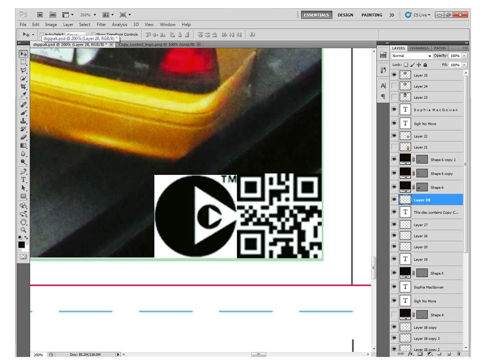
I added a barcode using Barcode Generator and I also added a QR Code, which make the digipak look more realistic, this is how they will look when up for sale in a shop. I added some text to the bottom as well it states the writer and producer of the album.

I added some lines to this section of the digipak to hide the overlaps between the four separate images - this makes it look more professional by hiding any errors.

I added some more text to the back such as copyright information and about the record label.
I then added the Copy Control logo, because I saw it on the back of an existing CD.

I chose to make all of my images but one black and white, because I think it creates an elegant image. The black and white also makes it look like photos from the past - like memories. I wanted to create this effect because the artist was in New York, but is now back in Britain and it like she is looking back at the visit which inspired the album.

All of my images used on the digipak are black and white apart from one, whilst the other images maintain continuity, there is one colour image. I chose to leave that image in colour because it contains the iconic New York yellow cabs. If I didn't make anything else colourful then the other image would remain to look irrelevant compared with the rest of the product. I made the font of the artist name and album title yellow to provide a link with the yellow cabs

This is the final draft of my digipak. I then saved it as JPEG image and posted it in a separate blog post, click here to see.
Digipak 4th Draft Feedback

This a print-out of the 4th draft of my Digipak, I then put my own annotations on my product for improvements in order to make it look even more professional. These include:
- increasing the size of the album title
- aligning the artist name to the centre
- rotating 'Island Records' logo 90 degrees CCW
- adding a barcode and a QR code to make it look realistic
- adding text to the bottom centre image i.e. produced by... written by... etc.
- putting lines on the bottom left to hide the overlaps between each image
Subscribe to:
Comments (Atom)