First I opened up the digipak template in Adobe Photoshop CS5.
I then opened up my first image in photoshop, that I want to use for the back cover of my digipak.
I then edited the image to make it look more professional and eye-catching. I did this by enhancing certain colours of the image.
I then copy the picture and pasted it on my template and edit>scale>transform so that it would fit in the box of the back cover image. I also had to crop the image slightly to make it fit to the size of the template. Then I added text to the back cover in the form of a track list.
This is how the image looks in the context of the whole digipak.
I then opened up my second image in photoshop, this will be used for the top right image of the digipak.
I then edited the colour of the image so that it was black and white - in order to create a vintage feel of the product. And black and white creates a reference to the past which reflects how the artist feels about New York.
I then copied the image onto my template and then had to scale it down to fit into the box for that image of the digipak. I then rotated the image 180 degrees, because when it is printed that will be folded over for the other side of the digipak.
This is a closer look at the two images in their respective places.
I then opened up my third chosen image in photoshop, I changed the colour of this image as well so that it is black and white to create continuity with the other images.
I scaled my third image down to fit into its respective place, I also had to crop the image using the rectangular marquee tool.
I also had to rotate this image 180 degrees so that it was the right way round for the other side of the digipak.
I opened up a new image in photoshop which will be used for the bottom left image, which I have chosen to split into four separate sections.
I then changed the colour of the image to black and white to maintain continuity between the images and then copied and pasted it onto my template.
I scaled my image down to fit into approximately a quarter of the bottom left image. So that there is room for three more images.
I then opened up another image in photoshop again for the bottom left image of my digipak. I edited the image to make it black and white to maintain continuity throughout.
I then copied and pasted the image and scaled it to fit to about a quarter of that side of the digipak.
I opened up a further image in photoshop and edited the image so that it is black and white to maintain continuity throughout the images.
I then copied and pasted the image onto my template and scaled and cropped it to fit into approximately a quarter of the square.
I opened my final image for the bottom left corner of my digipak and also edited the image so that it is black and white, thus maintaining the continuity with my other images.
I then scaled down and cropped the final image to fit into the last quarter of the bottom left corner.
The above image shows the bottom left section with all four images on it. And I have now added two black panels where the spines of the digipak are.
I opened up a new image in photoshop of the typical New York yellow cab, which has already been cropped to just show the registration plates and the bottom half of the cabs. I will crop it to the size of the spine.
The above image shows the images of the New York cabs cropped to fit the shape of both of the spines.
I then edited the images of the New York cab so that they were black and white like the rest of the digipak - thus maintaining continuity and the style that I have created.
I then added text to my spine in the form of an album title and a artist name, this informs the consumer of what they are buying when CDs are stacked.
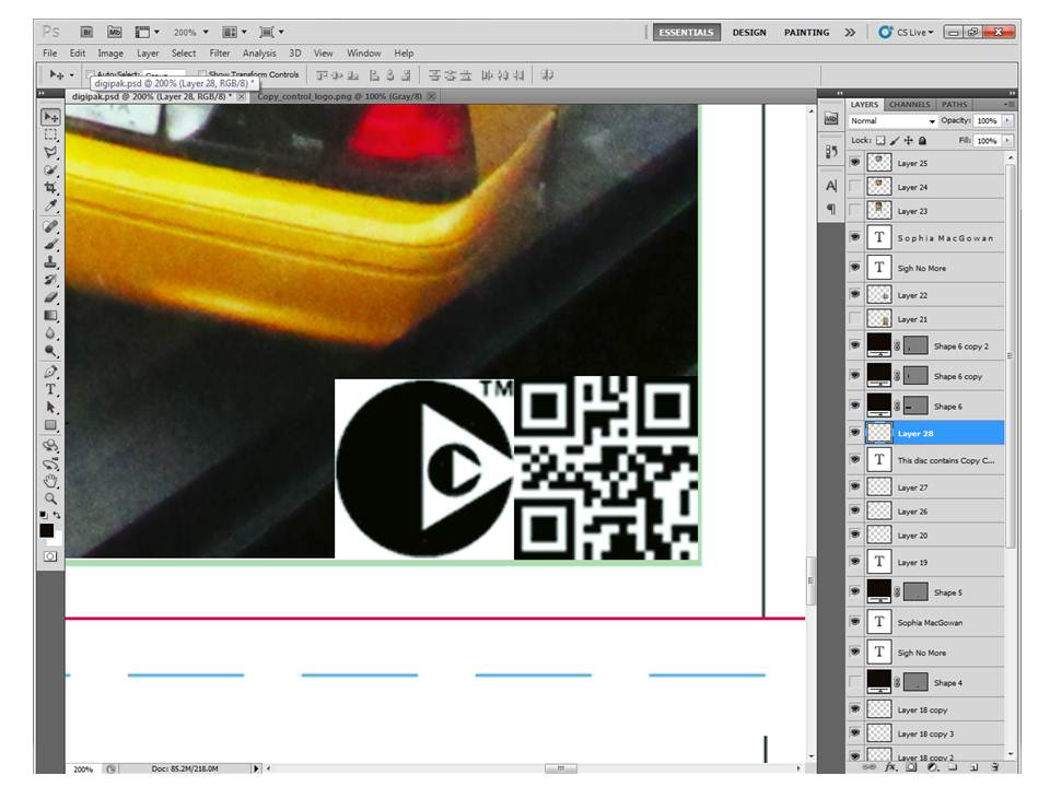
After I added the artist and album information I added a logo of Island Records to make the digipak look more realistic. I chose Island Records because Mumford & Sons are under that label - so it is extremely likely that my artist could get a record deal with them.
I then opened up a new image in photoshop for my front cover. I edited her face using the spot healing brush tool. And then copied it and pasted it on my template.
I cropped and scaled down my image to make it fit into the space allocated for the front cover image. I then added in a album title and a name for the artist. I used the same font that I used for the text on the spine - rage italic - in order to maintain continuity.
I opened my final image in photoshop, which I then edited with the spot healing brush tool. I used this tool to get rid of any spots in order to make the image look professional. I then copied it and pasted it onto my template.
I scaled / cropped my image so that it would fit into the allocated space for the top centre image.
I then edited the image again to make it black and white. I also rotated the image 180 degrees so that it is in the right place when it is printed out and folded over.
This is the 4th draft of my digipak.